Brand Identity
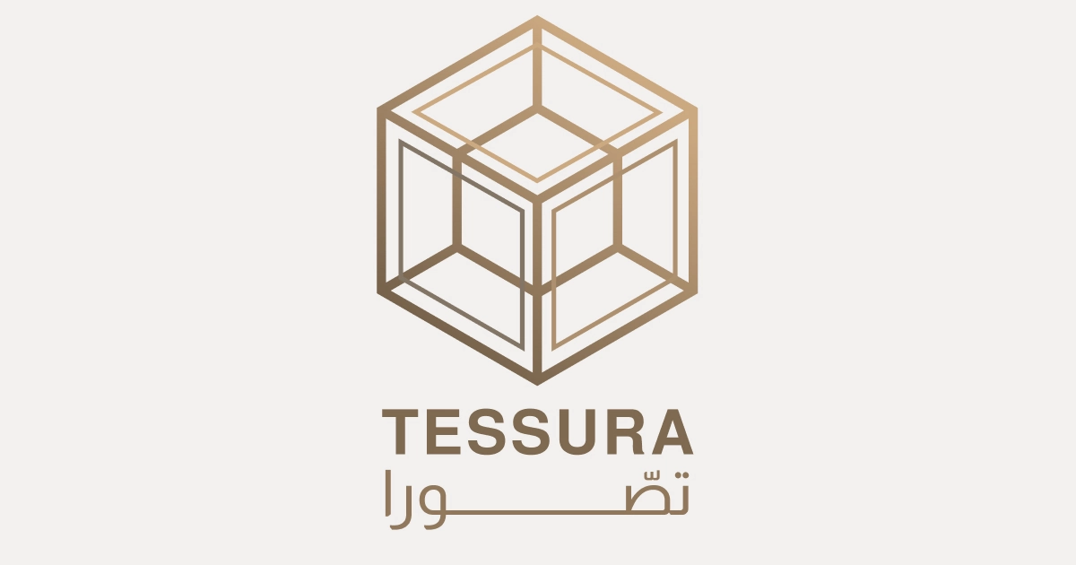
A bilingual identity design for a high-end visualization firm


Conceiving the Name
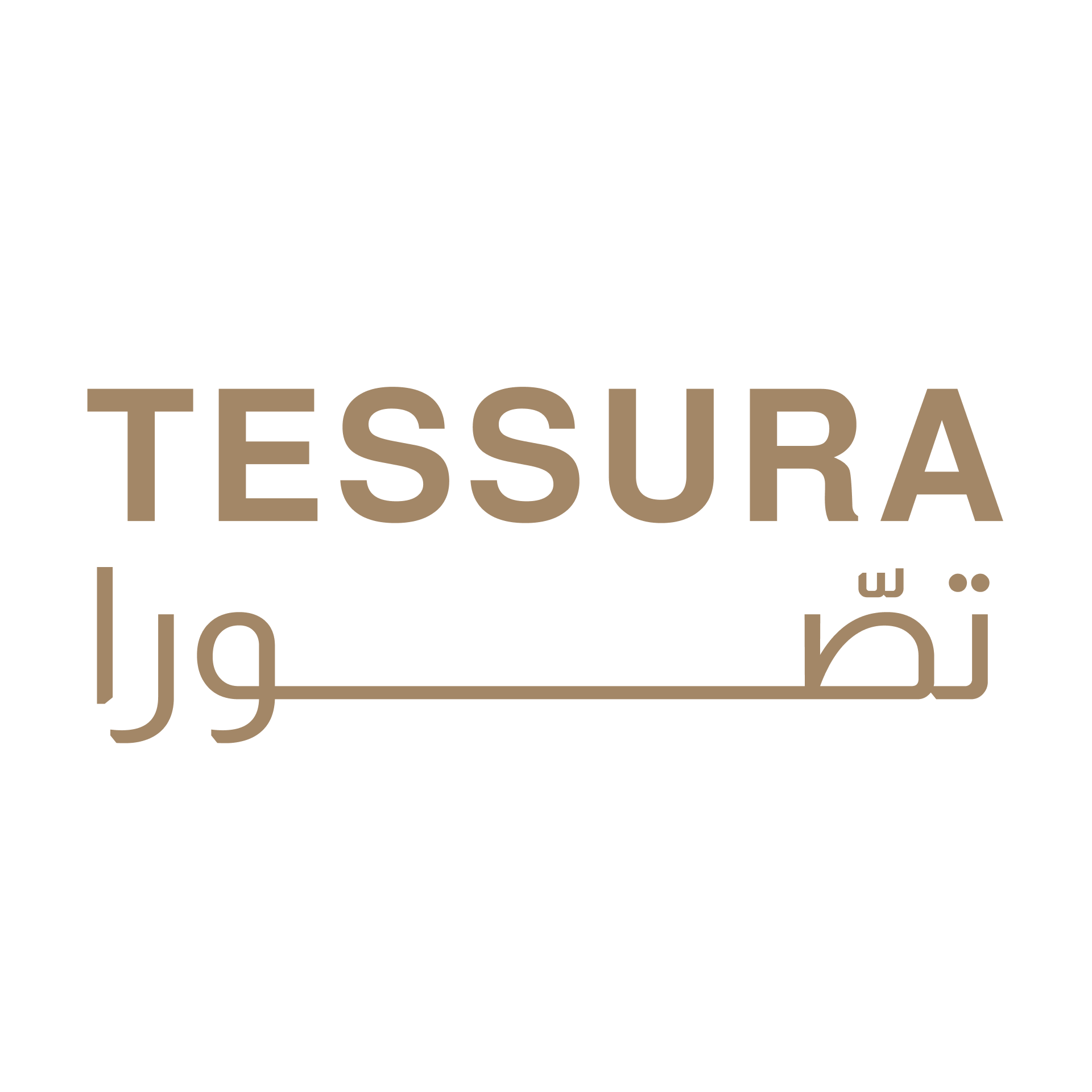
The company establishment in Dubai required a bilingual brand for both global outreach in English and local recognition in the UAE. Starting with the company's mission--to create spatial visualizations of spaces--the name was to reflect spatial design and forward thinking. The arabic word "تَصّور" (pr. "Tessawar") means to visualize, to conceive of an idea, to imagine. This also sounded a bit like the word "tesseract" - the 4D analaog of a cube, AKA a 4D hypercube, which fits with the future-focused design of the brand. Combining these two words took consideration and testing with native Arabic speakers to ensure that both the written and audible forms of the new name kept the essential T-S-WA structure of the original word while creating a new unique word that sounded strong, iconic, and pleasing to English speakers from around the globe. The name تصّورا (pronouned "TES-SOO-RAH") was carefully spelled using the strong ص (rather than the lighter س) and the diacritic above the "ss" (صّ) to give it a strong emphasis.
Designing the bi-lingual wordmark using kashida
In Dubai, it is quite common to see both English and Arabic forms of logos, names, and phrases everywhere. When the Arabic is written out above or below the English, it is typically stretched in a way to both match the English word length but also used to emphasize parts of the word in an aesthetic and psychological design. This stretch is called "kashida" and is most prominently used in Arabic more than other languages, because of the calligraphic nature of the writing system. There are a few "rules" of using a kashida, which we learned to create this wordmark. We chose the particular stretch for تَصُّـــــــــــــــــورا (Tessura) here to elongate the strong "ss" sound in the name and to show symmetrical graphical weight for the stacked wordmark.
Creating the 4D hypercube icon
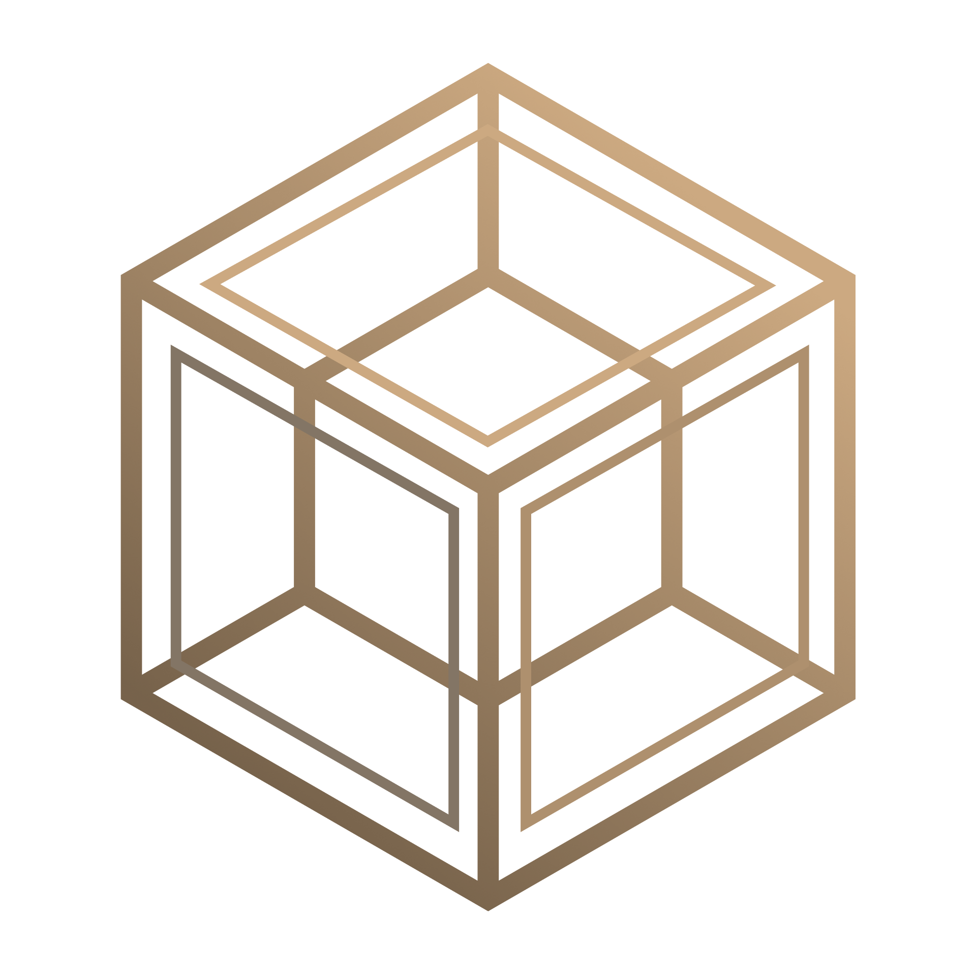
The tesseract origins of the name "TESSURA" and the meaning of the Arabic تَصّور (tessawar) perfectly inspired the cube within a cube icon. The logo is meant to evoke a lightweight wireframe of a digital space within a space - evoking the idea of a designed space realized virtually.
Keeping the logo as thin lines allows its use in multiple platforms and overlays from marketing assets to digital projects.
Designing a Digital Presence
- Website: The website (tessura.ae) is built to act as a digital gallery, using a minimal but elegant gold and 'bone' palette to allow the project renderings and graphics to be the focus.
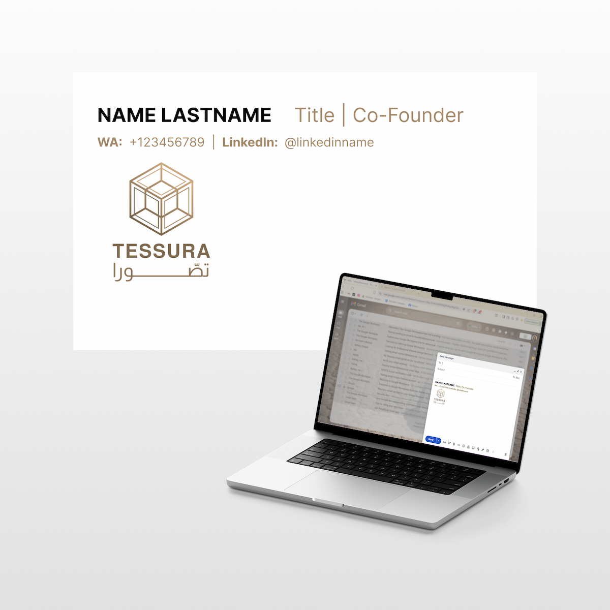
- Branding: To show the attention to detail that Tessura's high-end clients will expect for their own branded projects, the minimal and elegant graphics are used in both external and internal branding, including specialized email signatures that maintain the brand’s aesthetic for the entire team.
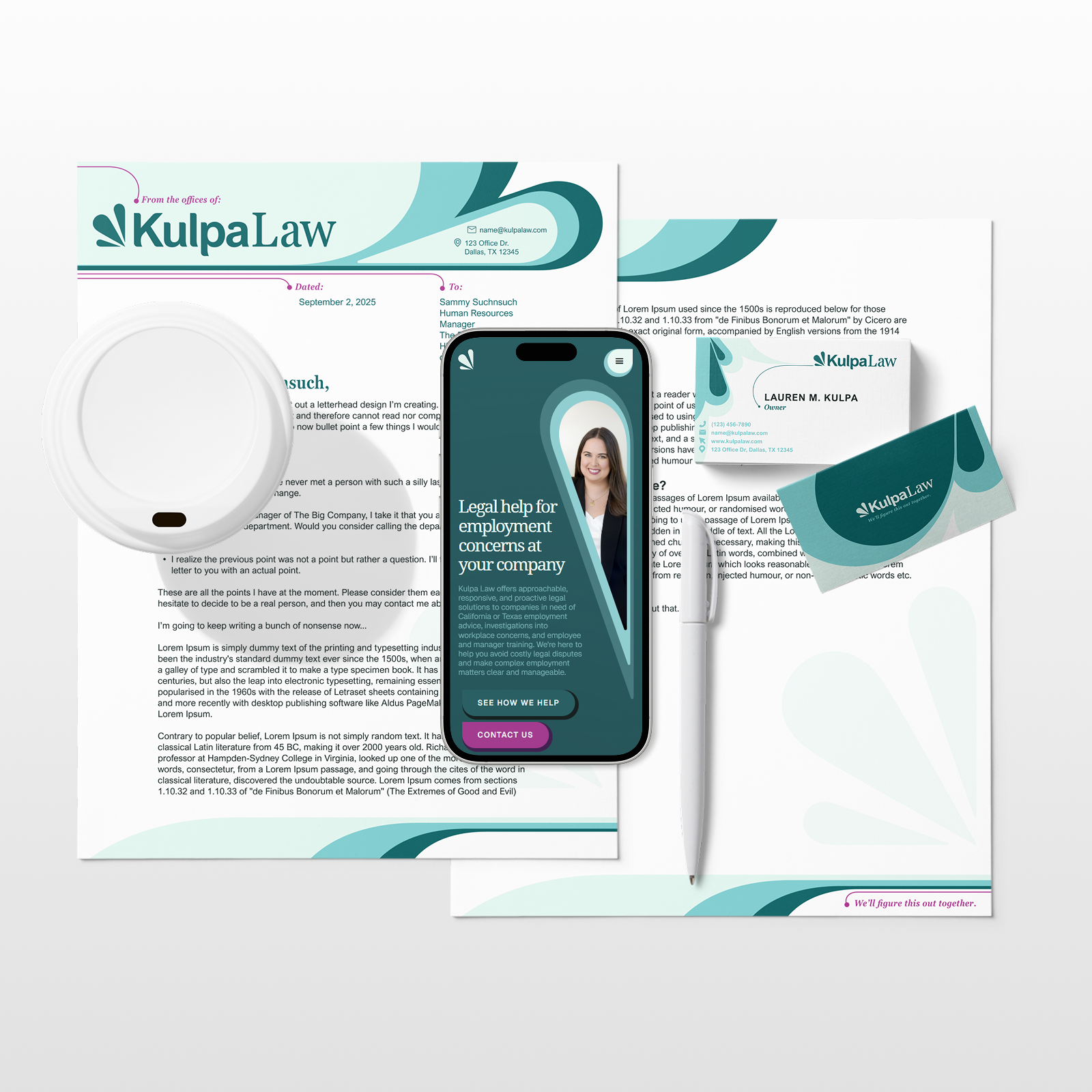
A full brand identity design package for a new law firm


Researching the law field to set a unique tone
After a decade in "big law," Lauren Kulpa sought a law firm reflecting her professional yet personal brand. While researching industry standards for Kulpa Law's corporate clientele, we noticed many firms focus heavily on achievements and news rather than client services and unique value. We aimed to differentiate Kulpa Law by presenting Lauren as a more modern, approachable lawyer focused on partnering with clients.
Creating a simple yet meaningful logo
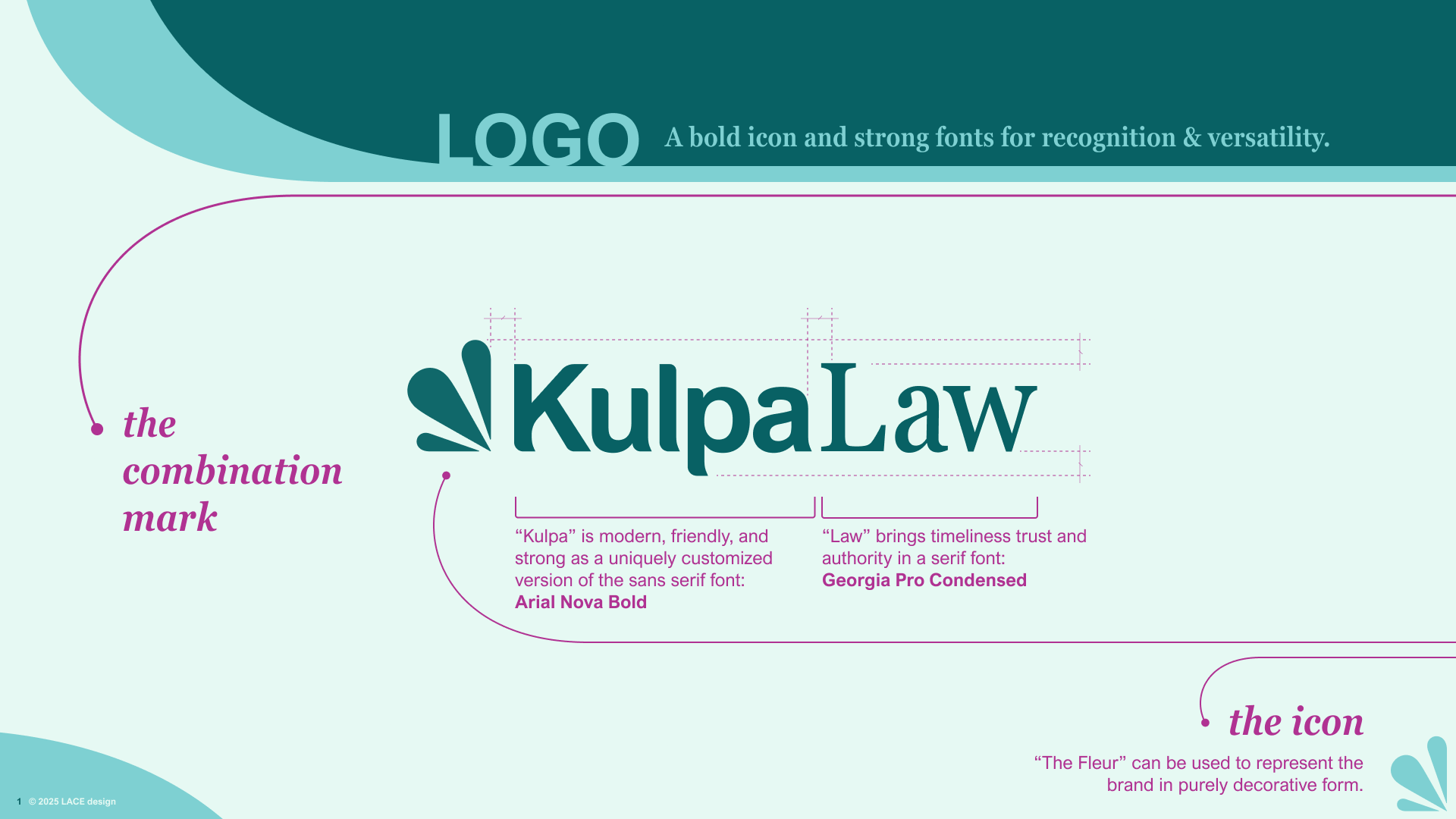
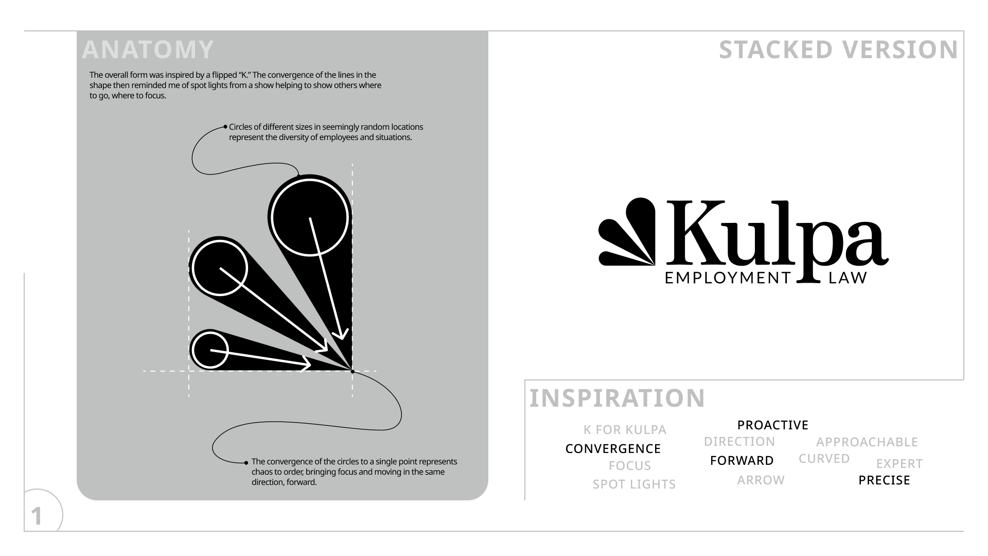
After researching the field and better understanding the client’s offerings and target audience, the initial task was to design the logo. The client was presented with three unique directions LACE designed, and chose “the fleur” - a simple, elegant representation of convergence, complementing the “K” in Kulpa and symbolizing the lawyer-client relationship and shared mission to bring order to chaos together.
Given the firm’s newness, we decided to go with a combination mark icon and wordmark) to build name recognition while growing familiarity with the icon.
Curating a personal and bold color palette
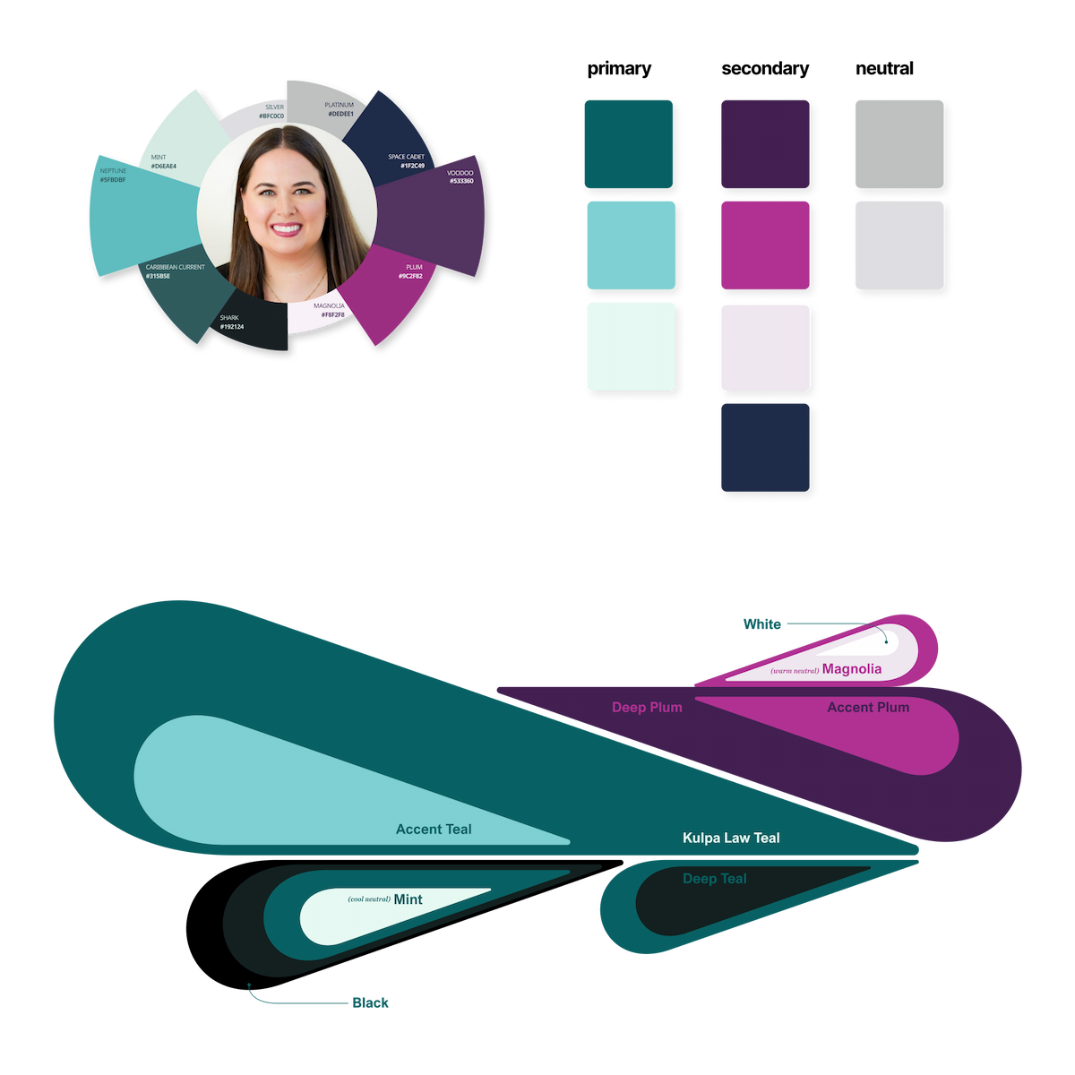
Since hiring Kulpa Law means you will be working personally with Lauren Kulpa, we wanted to create a color palette for the brand that reflects her, to be as bold as her personality and to complement her natural aesthetic. Using a seasonal palette approach, we determined her look as a ‘deep winter’ and used dark jewel tones for a bold and unique take on the corporate and somewhat overused navy in the law industry.
What came from the freedom to go bold and be unique is a playful twist on a professional palette, giving a fresh feel to perhaps a normally stiff and otherwise unapproachable field. When you hire Kulpa Law, you get a fresh and bold take on your situation.
The icon as brand graphics
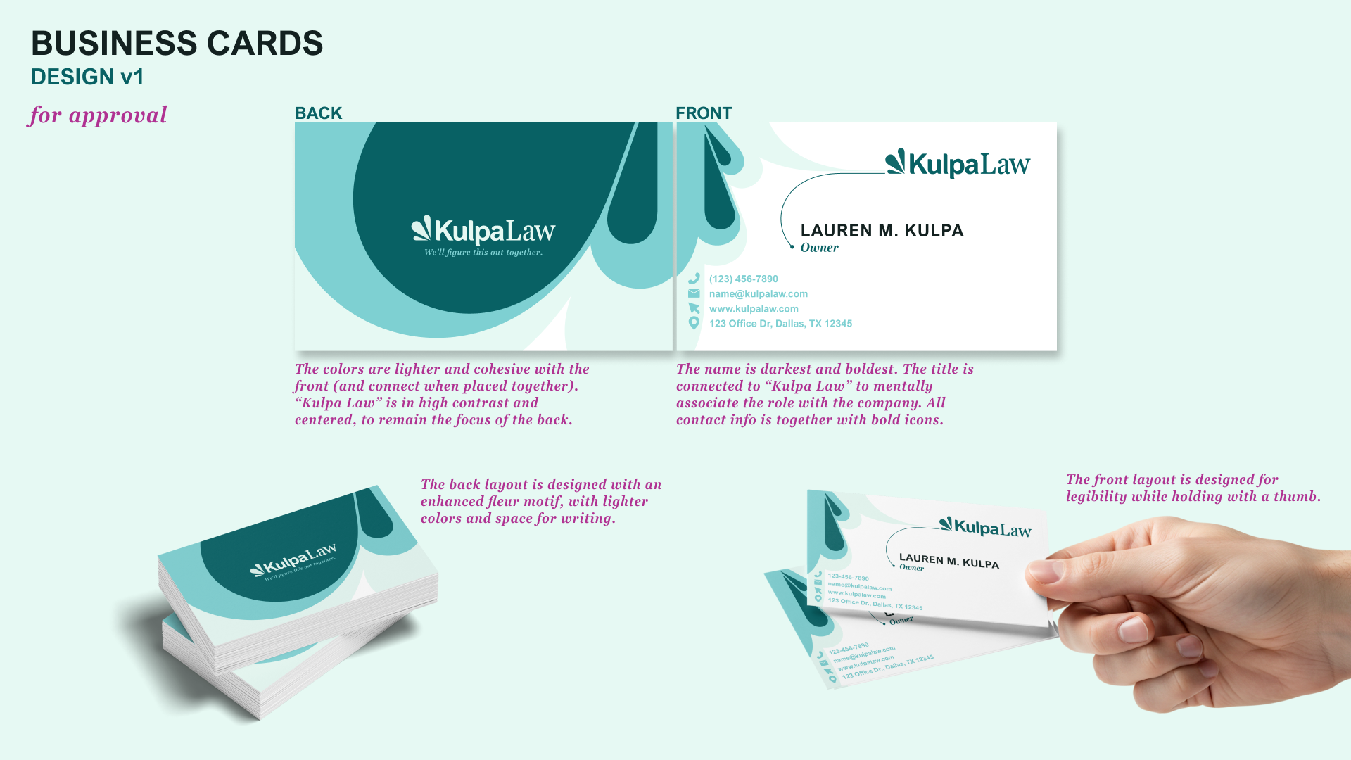
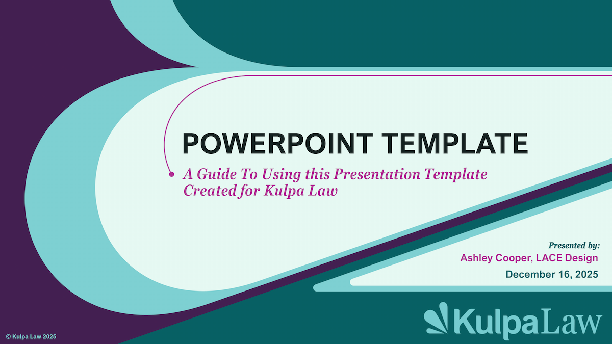
The simple fleur shape lent itself to many use cases in crafting a cohesive business essentials package. We used the shape to reiterate the brand in business cards, letterhead design, presentations, and the website. The layering of the fleur ‘petals’ and the use of the fresh color palette creates a unique and bold flavor to the brand, and allows for some very nice animations in presentations and the website.
Setting Brand Guidelines
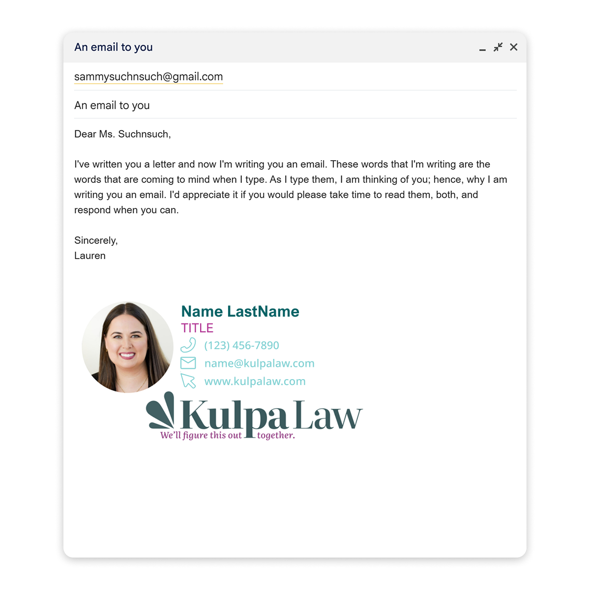
To ensure the brand is securely understood and used by internal team members and external use, LACE created a full style guide with logo variations and proper usage, typography selections, color hex codes, and templates.
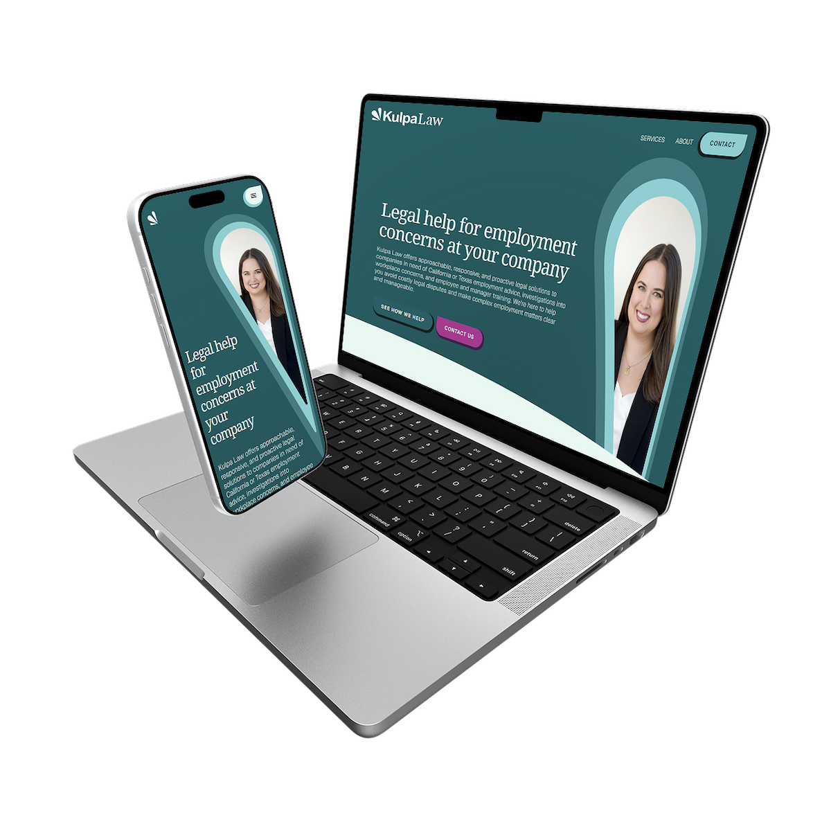
Building a digital presence
The brand design was then developed and consolidated into a website for Kulpa Law, including custom code for best SEO and to best link contact to the firm.
Visit www.kulpalaw.com for more info.
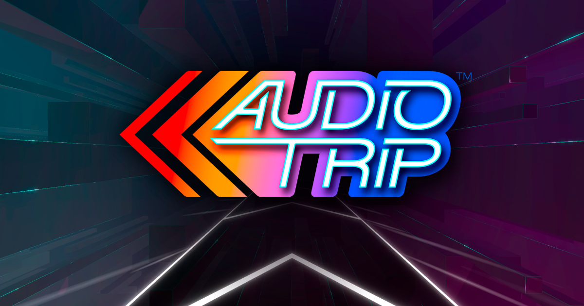
Full brand and graphic design for an award-winning virtual reality game
Naming Audio Trip
....
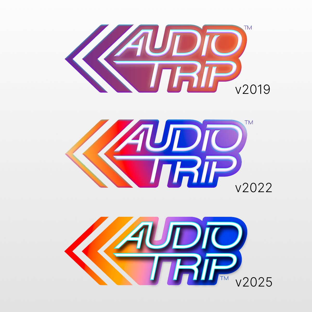
Creating a versatile logo
...
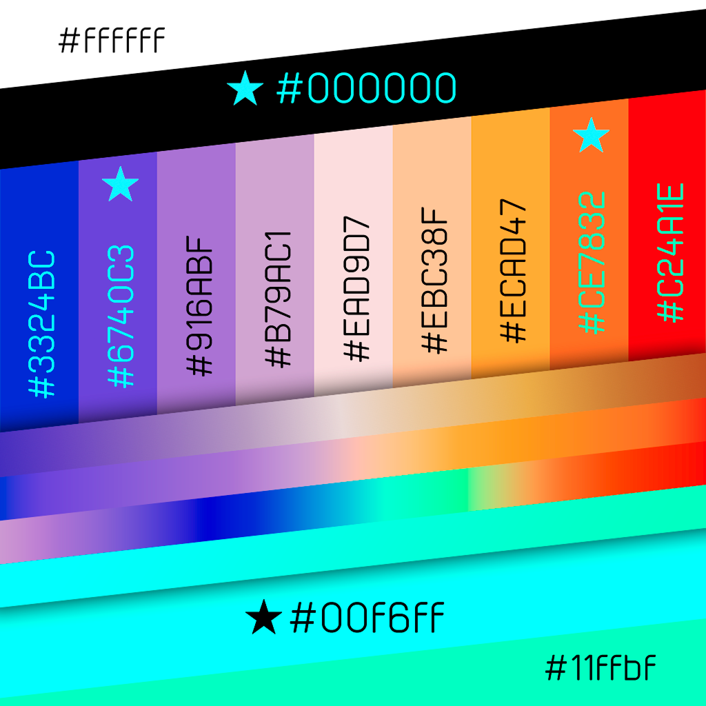
Designing a vibrant hi-energy color palette
...
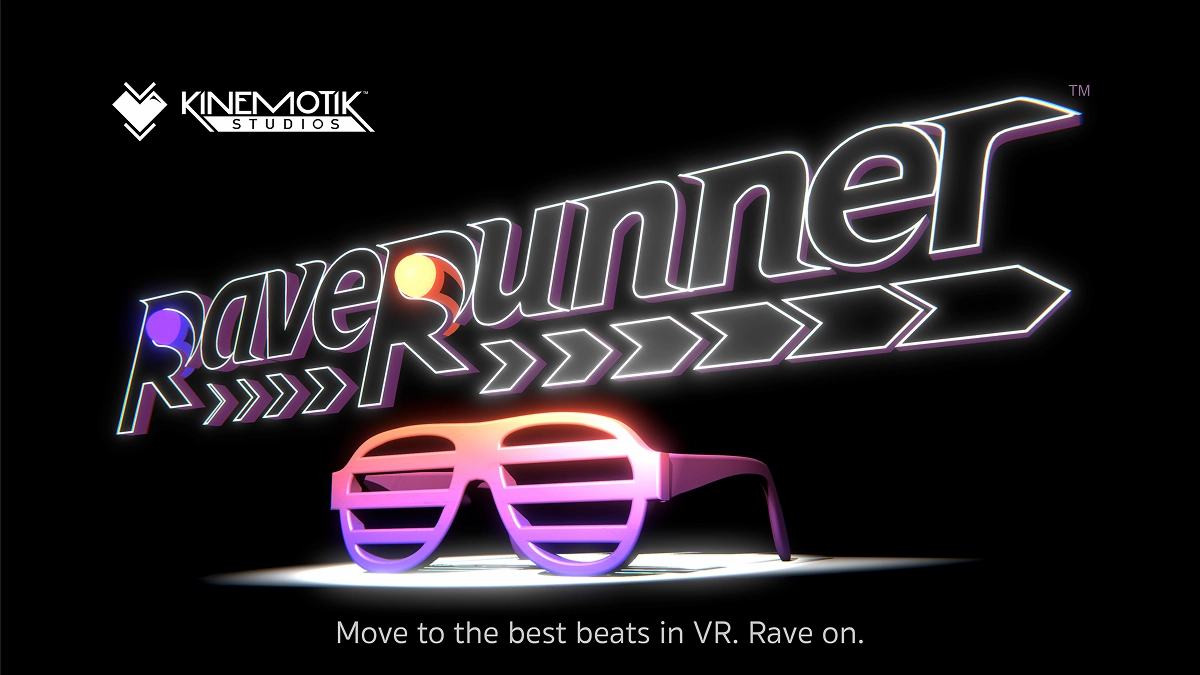
Brand design, graphics, and merch design for a virtual reality game

In games, the logo and art is everything. The game must stand out in a sea of catchy titles and art.
Designing the Logo
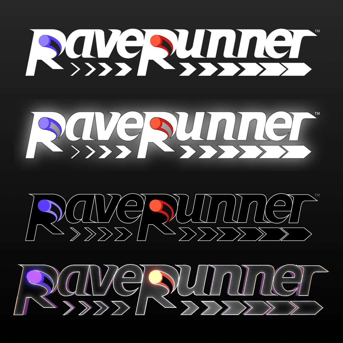
The VR game, RaveRunner, is a fast-paced dance game featuring a central chevron track the player glides along through worlds. The player's hands are glowing poi balls, one orange and one purple. The logo used the poi balls, chevron, and fast-pace of the game to inspire a high-contrast italic wordmark to be used on dark or light backgrounds.
Adapting to VR
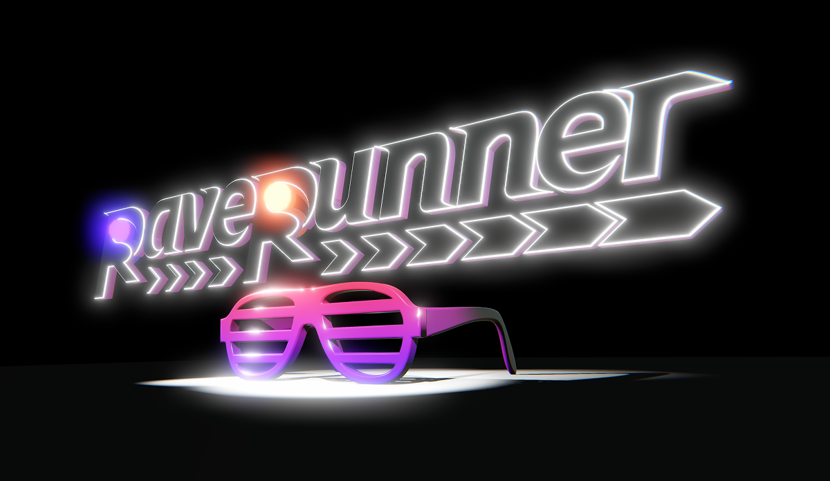
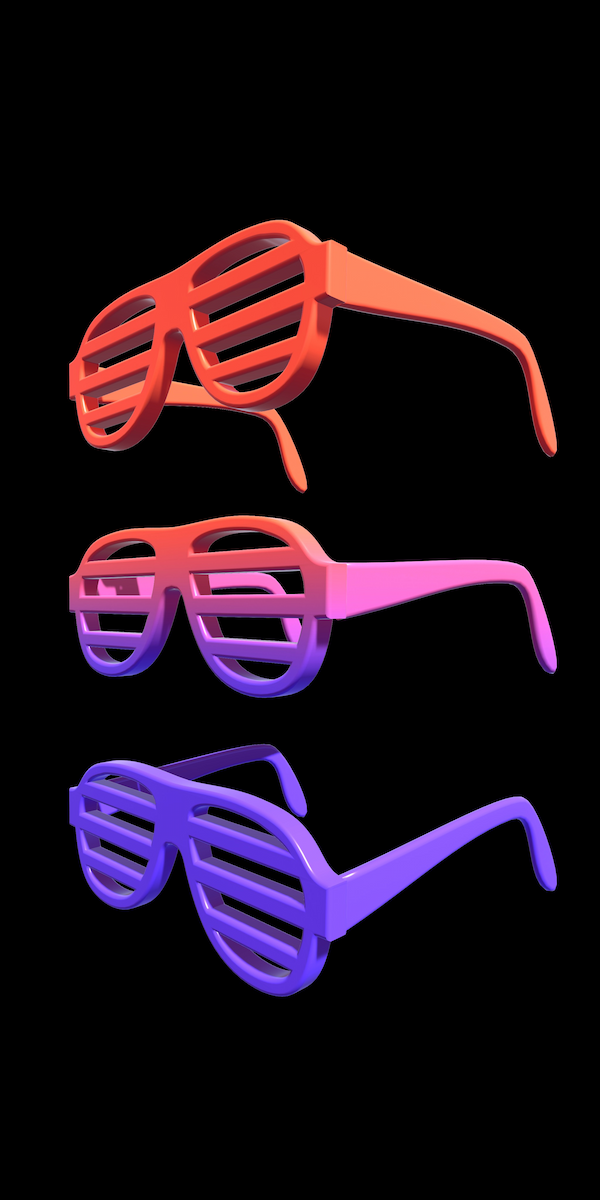
Since the game is in VR, the logo and iconic Rave Shades needed to be as tactile and immersive as the game. The RaveRunner logo line art was brought into Blender, extruded, then exported to an fbx for use in Unity for setting up lighting and ready for the game's splash scene and creating marketing graphics.
Marketing Graphics
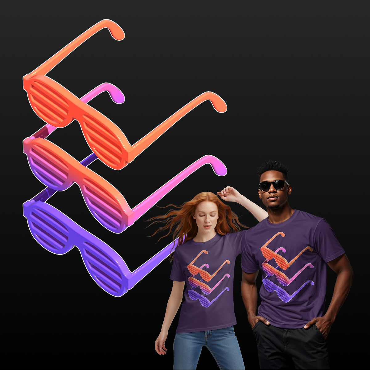
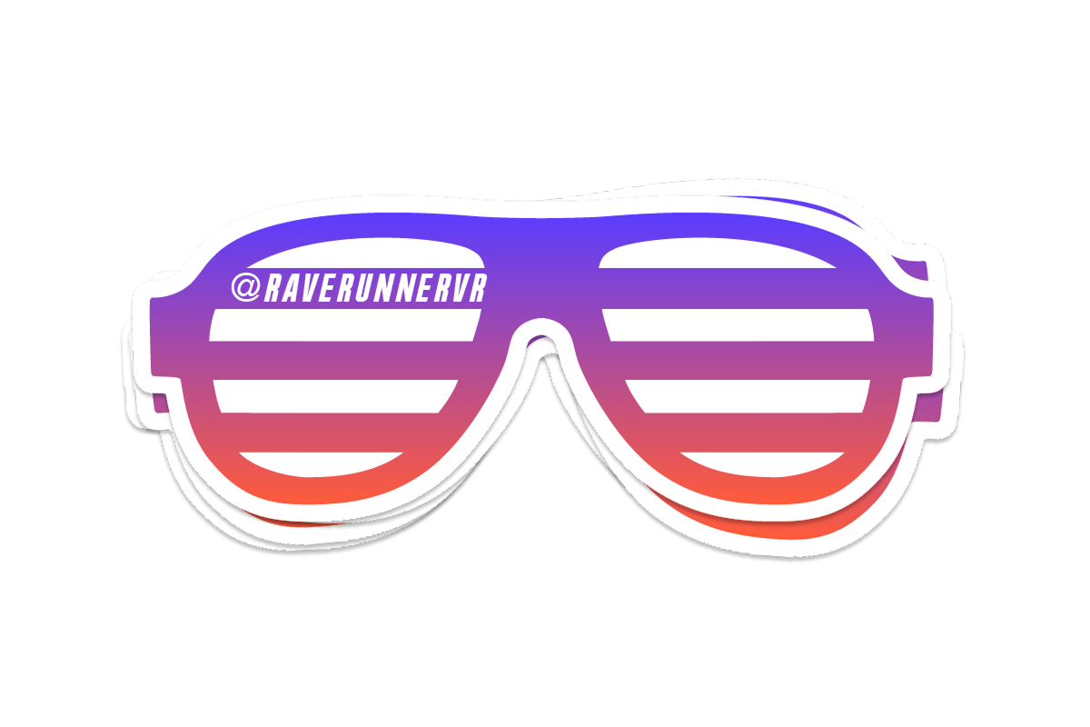
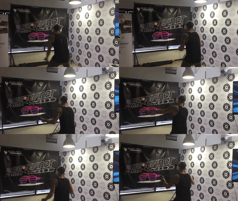
The rave shades became an icon for the game, used as both 2D and 3D graphics within the game. Since the model was in 3D, we had ample resources to place, light, and capture them for various uses like T-shirt designs, stickers, conference banners, leaderboard backgrounds, and animated graphics for various applications.
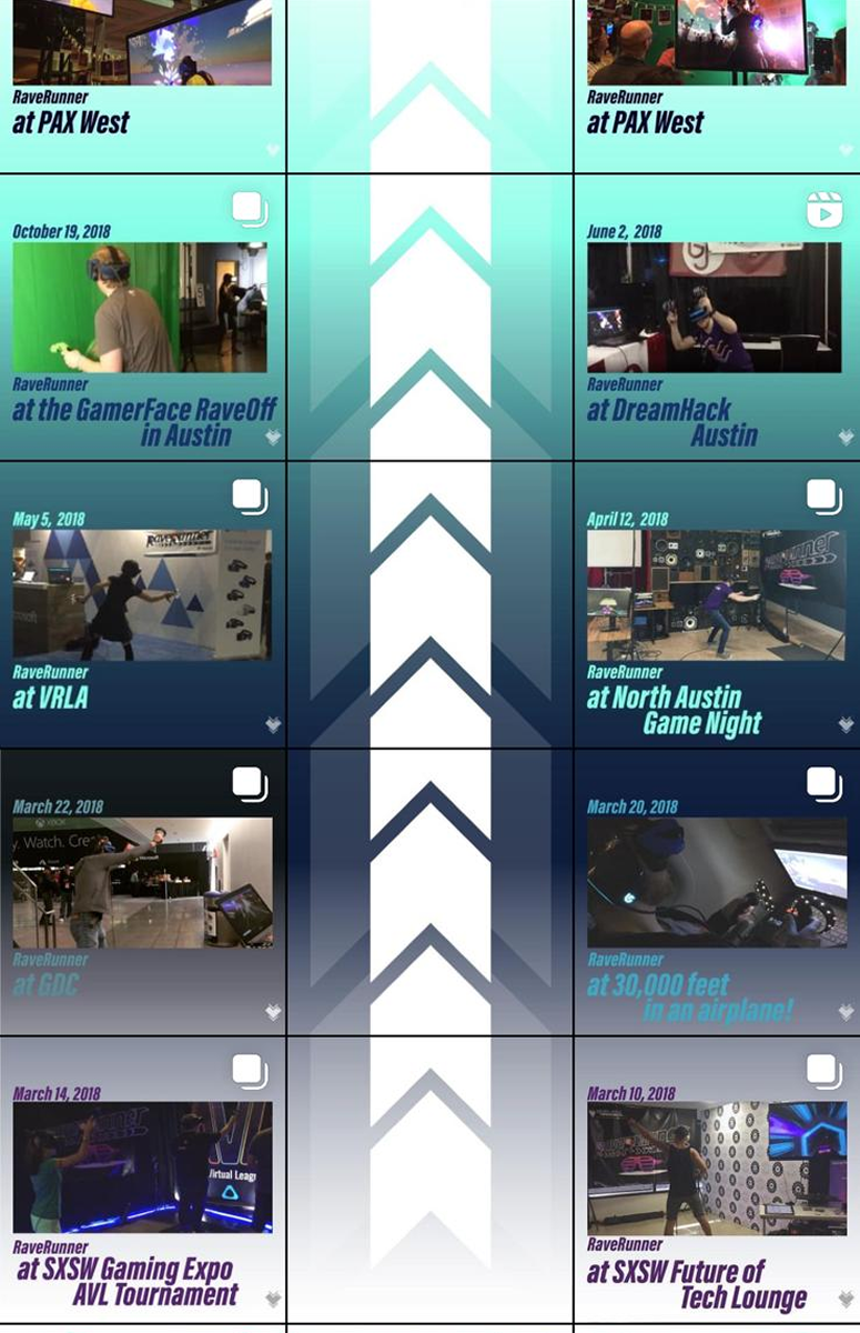
The chevron track was also a crucial part of the game and now logo, so the story of the game's evolution on Instagram used the chevron track to progress the chronology of the game during development.

Brand Identity, website, and Merch design for a VR game development studio

Kinemotik Studios is an award-winning game development studio, harnessing the power of game design, architecture, music, virtual reality, and an ever-expanding list of emerging technologies. They began as a duo in love, and have a passion for using cutting-edge technology to move people forward toward potentials and expanding internal and external perspectives on life.
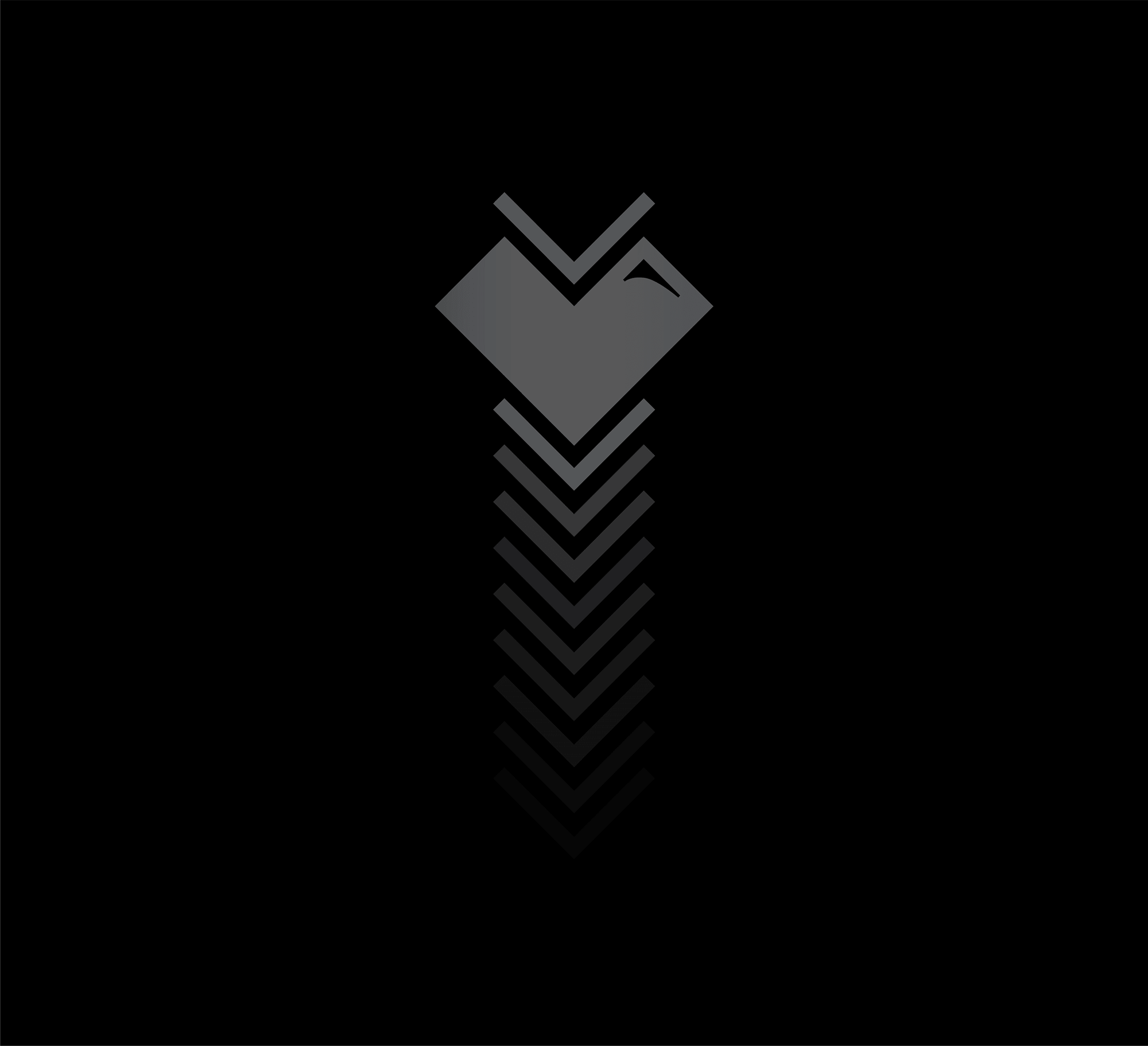
An icon reflecting physical and emotional movement
The heart within Kinemotik Studio's icon reflects the love and passion of the studio, which is at the heart of every project they create. The chevron shape signifies the movement, reflected in their motto: "We make experiences that move you."
The wordmark for Kinemotik Studios is a customized sans serif font, using the sharp features of the icon to show the strong forward movement concept of the studio's mission.
Together, the icon and wordmark create a strong combomark, used in their games and experiences to present the full studio's brand. The icon is monochromatic and simple in order to use in all scales, from a website ico to a full-bleed t-shirt.
Using the icon in marketing
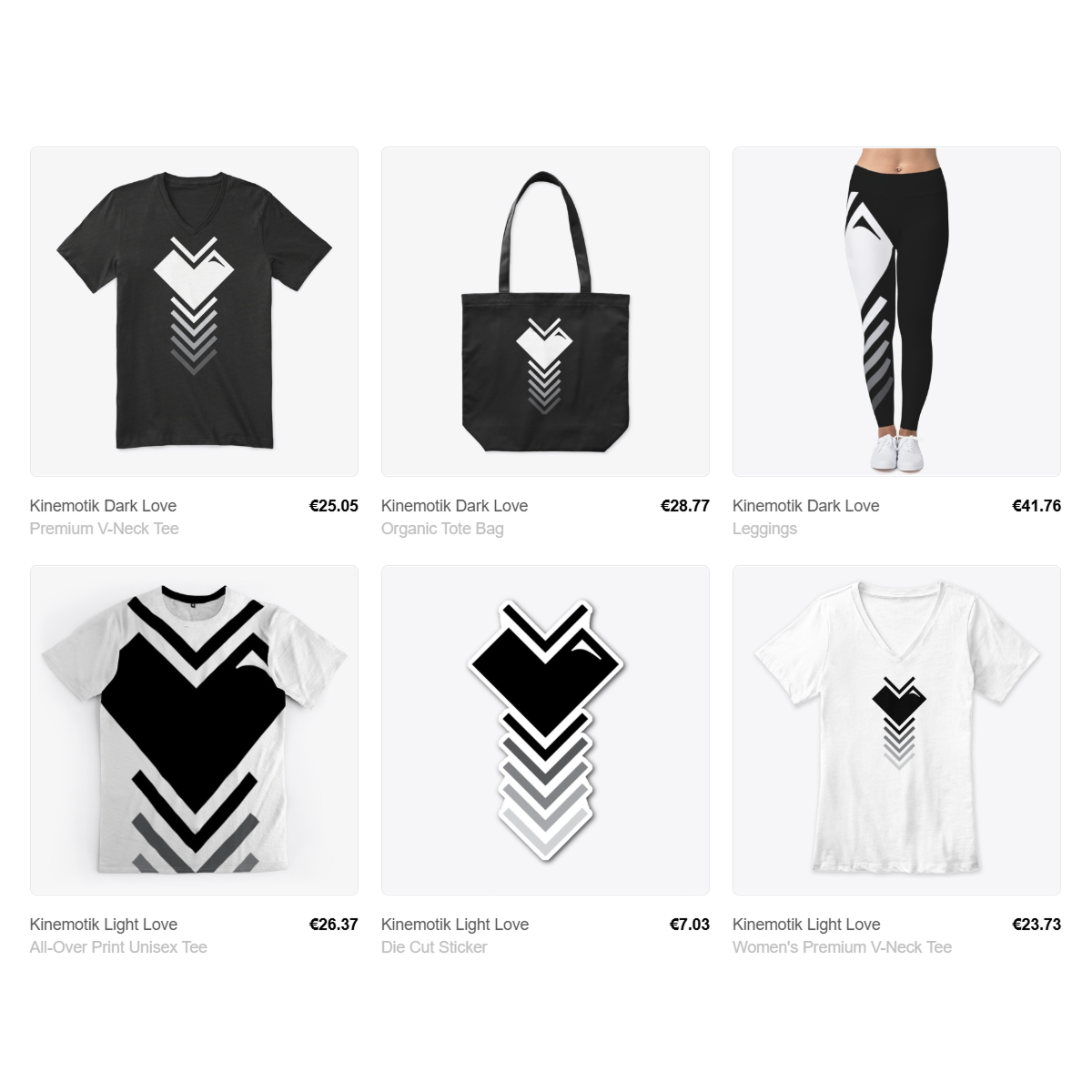
Since the icon was created to reflect the movement in the company's motto, iterations were created using the chevron design. This versatile design was used in marketing assets from t-shirts to website backgrounds.
Visit www.kinemotik.com to see the brand in action.
And if you want to support Kinemotik Studios even more, buy some of their merch here!
Logo design and marketing graphics for a professional bellydance troupe
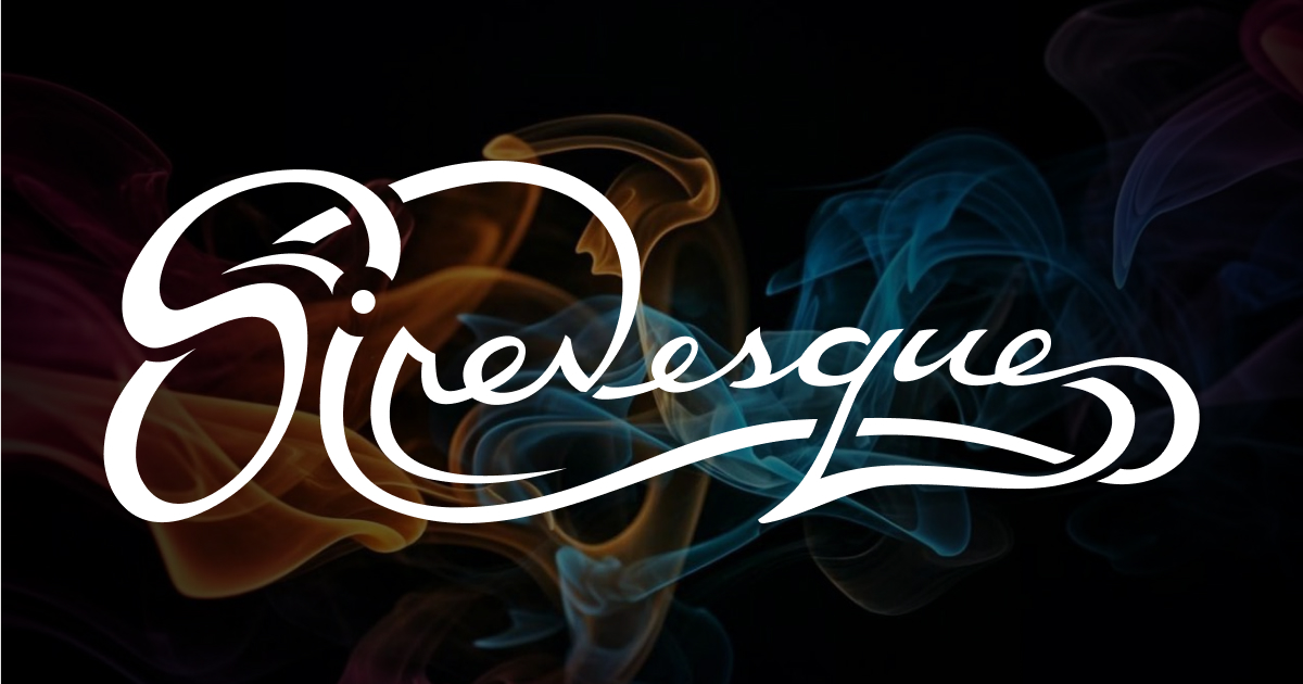
Sirenesque is a professional bellydance troupe known for their fluid yet powerful choreography, troupe synchronization, and a hybrid style of classical Egyptian Cabaret and tribal bellydancing.
LACE designed a bold hand-scripted sensual and somewhat tribal logo for the troupe, which was then used on business cards, troupe outfits, and other marketing necessities as they grew their clientele.

